Manchester City Centre Screenprint
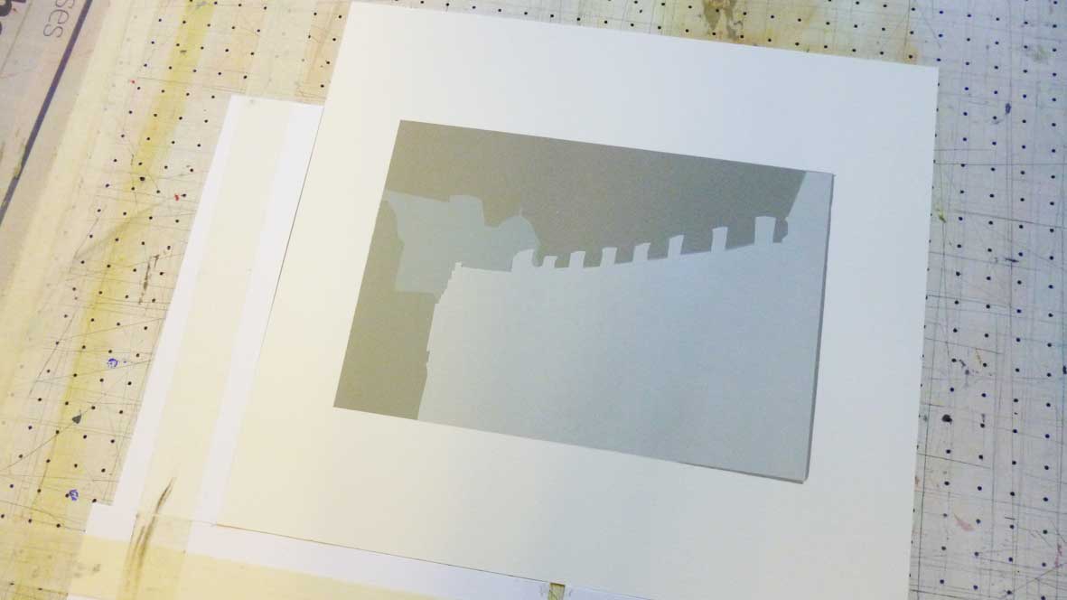
These photos show the different stages of creating this six colour screen print. All the layers except for the last one are paper stencils handcut by me. The greys only have a touch of burnt sienna and/or yellow ochre in to make them warm greys rather than a bluey, cold grey.


20:20 Print Exchange
The sorting for the 20:20 Print Exchange is happening this week. The 20:20 is a national print exchange organised by Hot Bed Press whereby printmakers from studios across the UK each submit an edition of 25 prints measuring 20cm x 20cm. The prints are then sorted and each participant gets a random selection of prints back. Last year over 300 people submitted prints – I won’t reveal how many people have entered this year but it’s a LOT more…
My 20:20 entry is a three colour screenprint entitled ‘Print Manufactury’, created from a drawing I did of the Hot Bed Press studio building. The base white colour and the blue door were both created using paper stencils cut from newsprint. The third and final layer of black was from a photo-emulsion screen.
Here’s the original drawing…

And here’s the final screenprint. I used Somerset Grey paper so I could apply a white background for the building. I wanted it to be a completely self-contained image on the paper so removed anything outside the building that might ground it – for example the pavements, streetlights and surrounding buildings.

Hyde Indoor Market artwork unveiled!
Following six months of consultations, workshops, meetings, fabrication and lots of sanding, the Hyde Indoor Market artwork was unveiled on Saturday 6th April. As I’ve mentioned previously, the artwork consists of 3D letters which spell out the words ‘Hyde Indoor Market’, with each letter representing something different sold within the market.
In terms of fabrication the letters presented a variety of challenges as they all required different processes to complete them – these included mosaics, mould-making and casting, decoupage, illustration, knitting and painting to name but a few. Detailed images of each letter can be seen here on the Woodend Artists flickr page but I’ve included a select few below.


Hyde Indoor Market Artwork
Last year, myself and fellow artist Richard Dawson were commissioned by Tameside Metropolitan Borough Council (TMBC) to create some artwork for Hyde Indoor Market. The aim of the commission was to increase knowledge and awareness of the market – we worked with the market tenants to come up with a design and concept and worked with local community groups to produce some of the artwork.
The final design is a sign that says ‘Hyde Indoor Market’, with each individual 3D letter depicting something sold within the market. The letters are a mixture of box frames containing various items, are clad in objects or have graphics applied to their surface.
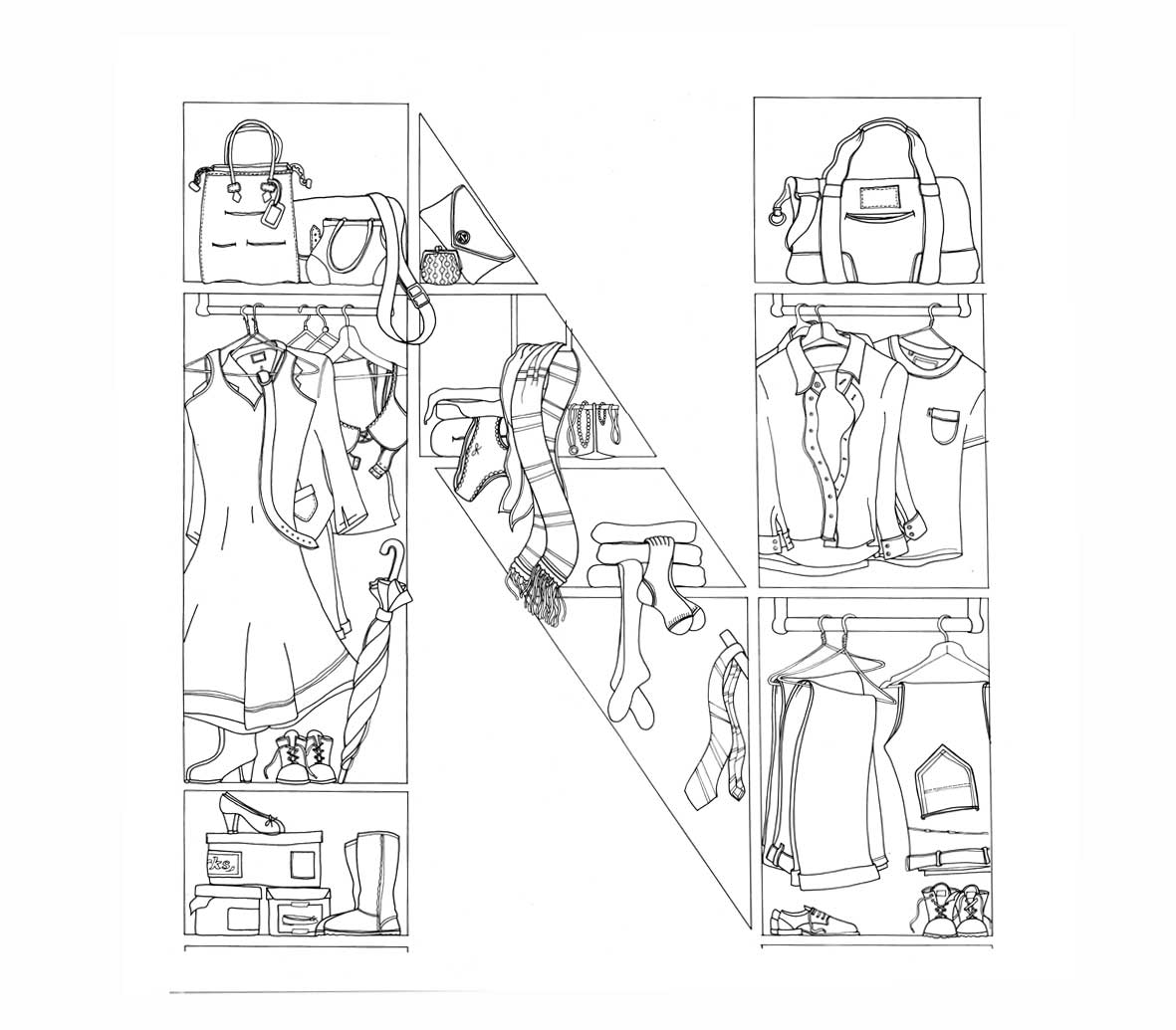
This is the letter N, which depicts the ladies wear, menswear, footwear and jewellery stalls with an illustration of a wardrobe and the items contained within. The images show the first pencil drawing of the wardrobe and the inked-in versions and then the final one, which was scanned in, cleaned up in Photoshop and then colour rendered in Illustrator. The final letter has a wood effect finish on the sides, with a printed vinyl applied to the front with the illustration on.